Overview
Mr. Alan’s Shoe & Sportswear
Mr. Alan’s is a retail staple that has been serving up style in Detroit since the 70s. Recently, they underwent a massive re-brand to modernize their stores and shift focus toward premium clothing and highly sought-after sneakers. However, their online presence was essentially nonexistent. They brought me on board to translate their new premium brand into a high-performing digital storefront and launch fresh marketing campaigns.
The Problem
As a traditional brick-and-mortar operation with numerous physical locations, Mr. Alan’s was understandably hesitant to invest heavily in e-commerce. Their previous attempt at a small online store struggled with fraudulent orders and practically zero traffic, leaving a bad taste in their mouth. The challenge was to build a secure, robust online experience that they could trust, while capturing the aesthetic of their physical stores.
The Solution
Challenge accepted! Within a few months, I designed and developed a custom Shopify storefront that absolutely shattered expectations—quadrupling Mr. Alan’s online sales in its first six months!
Because online inventory was initially limited, I heavily utilized A/B testing and site analytics to pinpoint exactly which products and variations online shoppers craved. By rolling out strategic email cadences to hype up product launches and utilizing smart in-cart add-ons, the website’s revenue skyrocketed, eventually outpacing some of their top physical storefronts! Ultimately, this digital transformation played a massive role in scaling the company to the point where they were successfully acquired by SNIPES.

Research
Deep Dive into MrAlans.com
I kicked things off with a thorough audit of their old site, digging into their metrics, product pages, and landing pages. Here are the glaring gaps I found:
- General Inconsistencies
The website’s branding completely clashed with the new, premium Mr. Alan’s aesthetic. Product information and imagery were scattered and inconsistent. - Products & Collections
The majority of products listed were out-of-stock or discontinued. Even worse, there were no logical product collections, making browsing a nightmare for users. - Navigation
There was no clear path for users to actually find what they were looking for. - Metrics & Analytics
They lacked any robust site metrics beyond basic sales and views. - Reviews & Customer Feedback
Zero integration for product reviews or customer feedback loops.
In-Store Experience
To fix the digital experience, I had to understand the physical one. I toured several flagship storefronts to soak in their overall branding and study how they merchandised their premium products. I took detailed notes on their signage and photography to ensure our digital assets would perfectly mirror the physical vibe. I also used this time to chat with employees and learn exactly what customers were asking for on the floor.
Sales Team Interview
I sat down with the sales team to get a clear picture of inventory levels, top sellers, and the typical cadence of sneaker releases. This intel was crucial for deciding which products we needed to feature prominently on the homepage at launch.


Understanding The Customers
Through my research and interviews, two distinct target customers emerged. I built personas around them to guide our design decisions:

Feature Roadmap
I mapped out a prioritized list of features and templates needed for a successful launch, ensuring the most critical items were tackled first.

Design
Designing Wireframes
I started by mocking up high-level, low-fidelity wireframes for each page and template. Keeping things low-res early on is a great way to help stakeholders focus purely on layout, functionality, and user flow without getting distracted by colors or fonts.

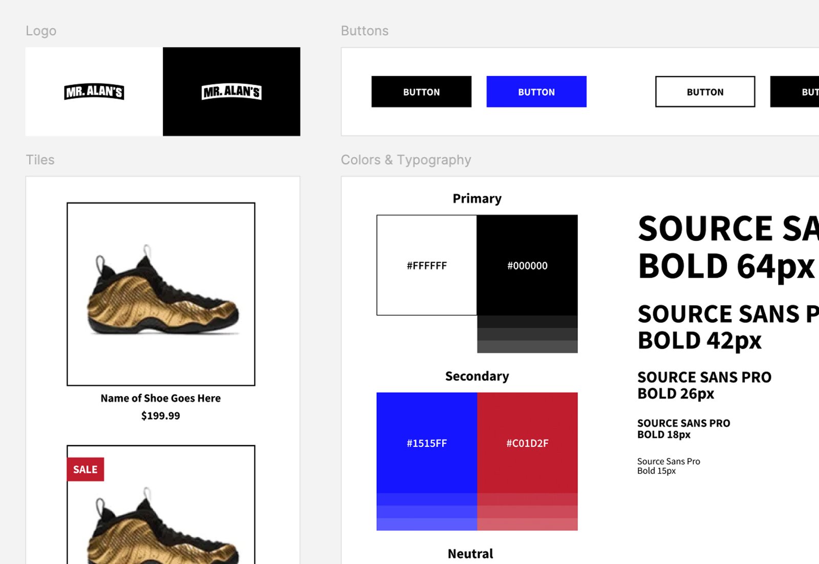
Visual Design, Branding & Photography
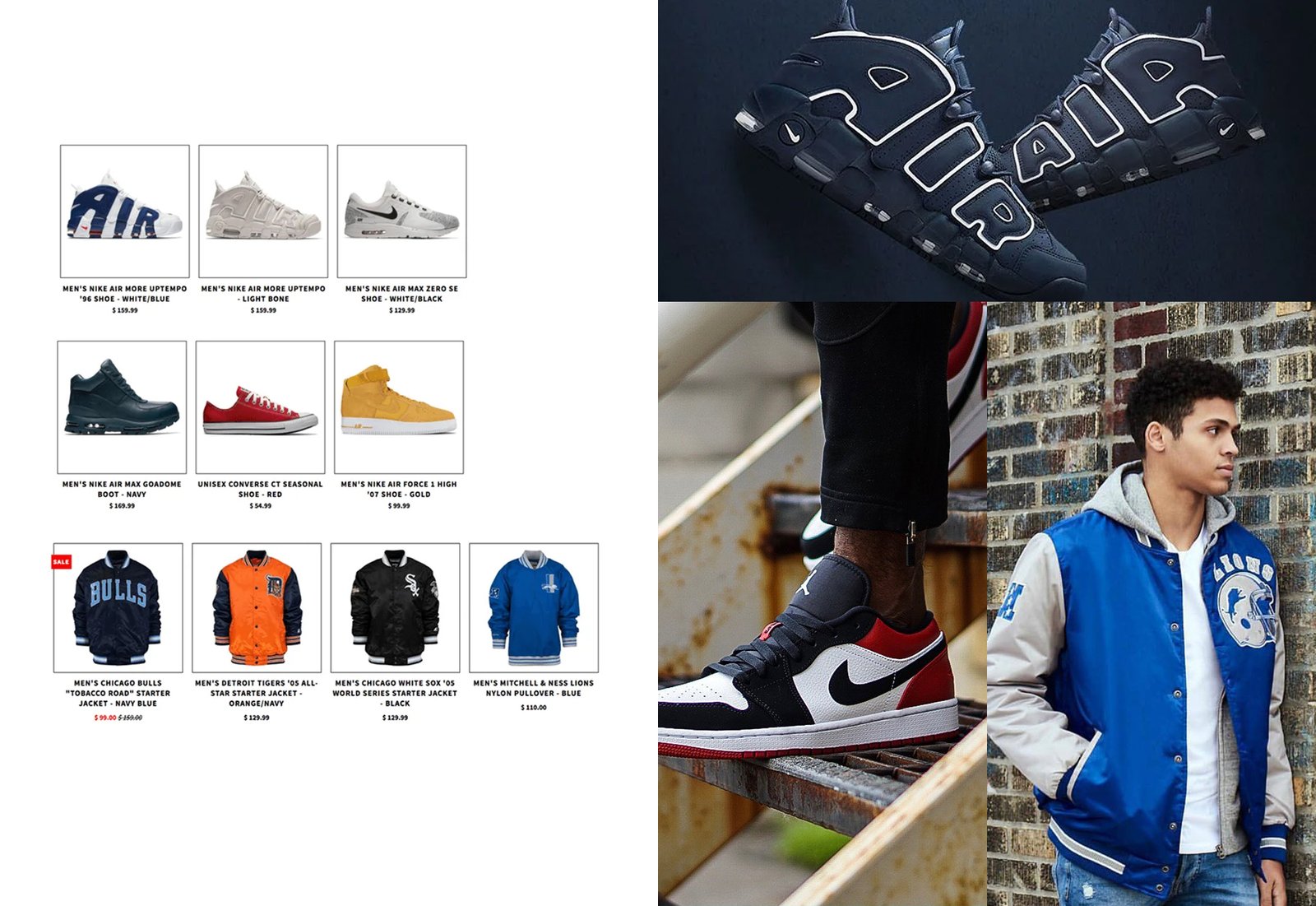
Drawing inspiration directly from Mr. Alan’s updated brand guidelines and their sleek in-store aesthetic, I brought the wireframes to life. By utilizing their exact typography, color palettes, and gritty-yet-premium photography style, we achieved a perfectly cohesive brand experience.
Testing & Tweaking
Lets Test Usability
Before going live, I ran moderated usability testing sessions with several employees to see how easily they could navigate the new flow.
The testing checklist:
- Navigate from the homepage to a specific collection.
- Use the collection filters to narrow down the products.
- Select an item and complete the full checkout process.
- Find the contact page and submit a feedback form.
The team crushed the tasks! They loved how intuitive the navigation was and felt the imagery perfectly captured the new Mr. Alan’s vibe. They also provided some great feedback that we implemented:
Additions: We added a section highlighting their “Best Place in Detroit to Buy Shoes” award, and built out a dedicated Sneaker Release Calendar to keep our “Sneaker Head” persona happy!

Final Design


