FordDirect
Welcome to the FordDirect project! FordDirect is an absolute powerhouse, offering an array of products and partnered services that help Ford and Lincoln dealers across the nation sell more vehicles, all backed by Ford’s exclusive proprietary data.
The Problem
FordDirect is a cutting-edge, data-driven tech company—but their old website didn’t look the part. While functional, it lacked the polished, innovative feel of an advanced digital enterprise. They needed a digital presence that truly reflected the high-tech solutions they provide to their dealers.
The Solution
To bridge this gap, I helped lead the charge to design and develop a completely revamped website. The goal was to strike the perfect balance: a sleek, high-tech aesthetic that still felt distinctly human. By embracing white space and crystal-clear content delivery, we transformed the user experience. I not only led the front-end development—hand-coding all the HTML and CSS—but also managed task prioritization for the broader development team. The final result is a beautiful, modern site that accurately visualizes FordDirect’s true identity.

Research
Collaborated Efforts
For this overhaul, FordDirect partnered with a marketing firm to help us move quickly. Working closely with their team, I kicked things off by researching top-tier tech websites, taking detailed notes on their typography, color palettes, spacing, and overall vibes.
Apple
Apple sets the gold standard for clean, professional design. Their brilliant use of negative space and stunning imagery creates a highly appealing experience. However, because they sell physical products, they rely more heavily on imagery than FordDirect would need to.
Meta
Meta also executes a wonderfully clean aesthetic. Similar to Apple, they use negative space effectively, but they incorporate subtle gray tones and clean fonts to create a very “friendly” tech feel.
IBM
IBM’s site handles a lot more text—which was closer to the direction FordDirect needed to go. They use iconography well to define features, but their lack of negative space can make the site feel a bit overwhelming to digest.
Clean, Informative & Humanistic
Armed with these insights, we established our core design pillars:
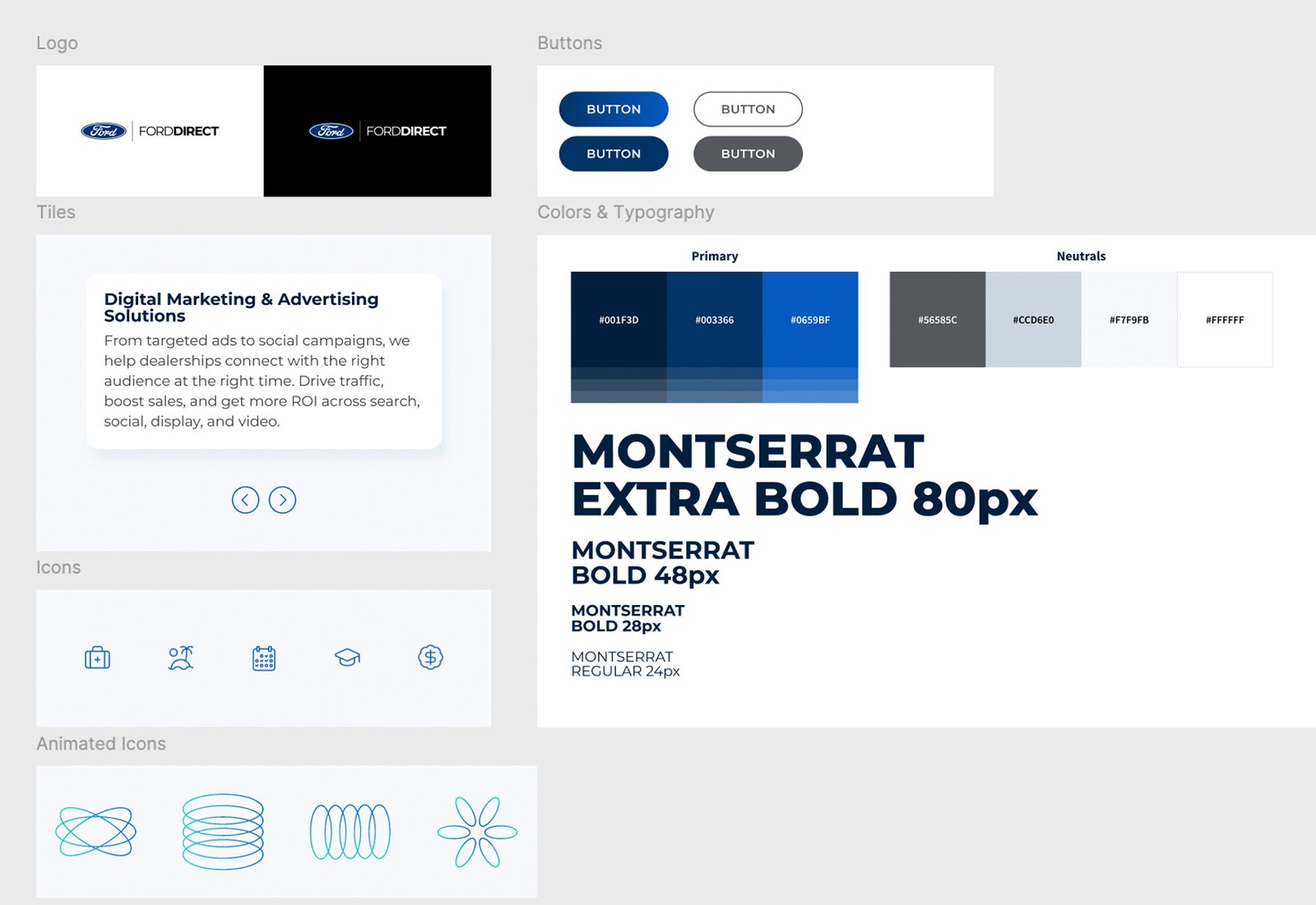
- Typography & Colors
We opted for a crisp Sans Serif font in bold weights to create clear, scannable sections. Pairing this with a sophisticated gray palette and a signature FordDirect blue accent gave us that perfect “tech” style. - Imagery & Iconography
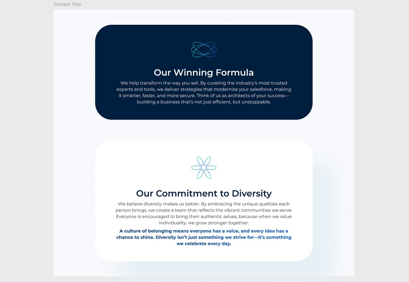
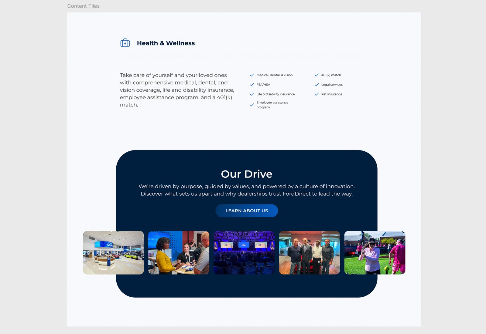
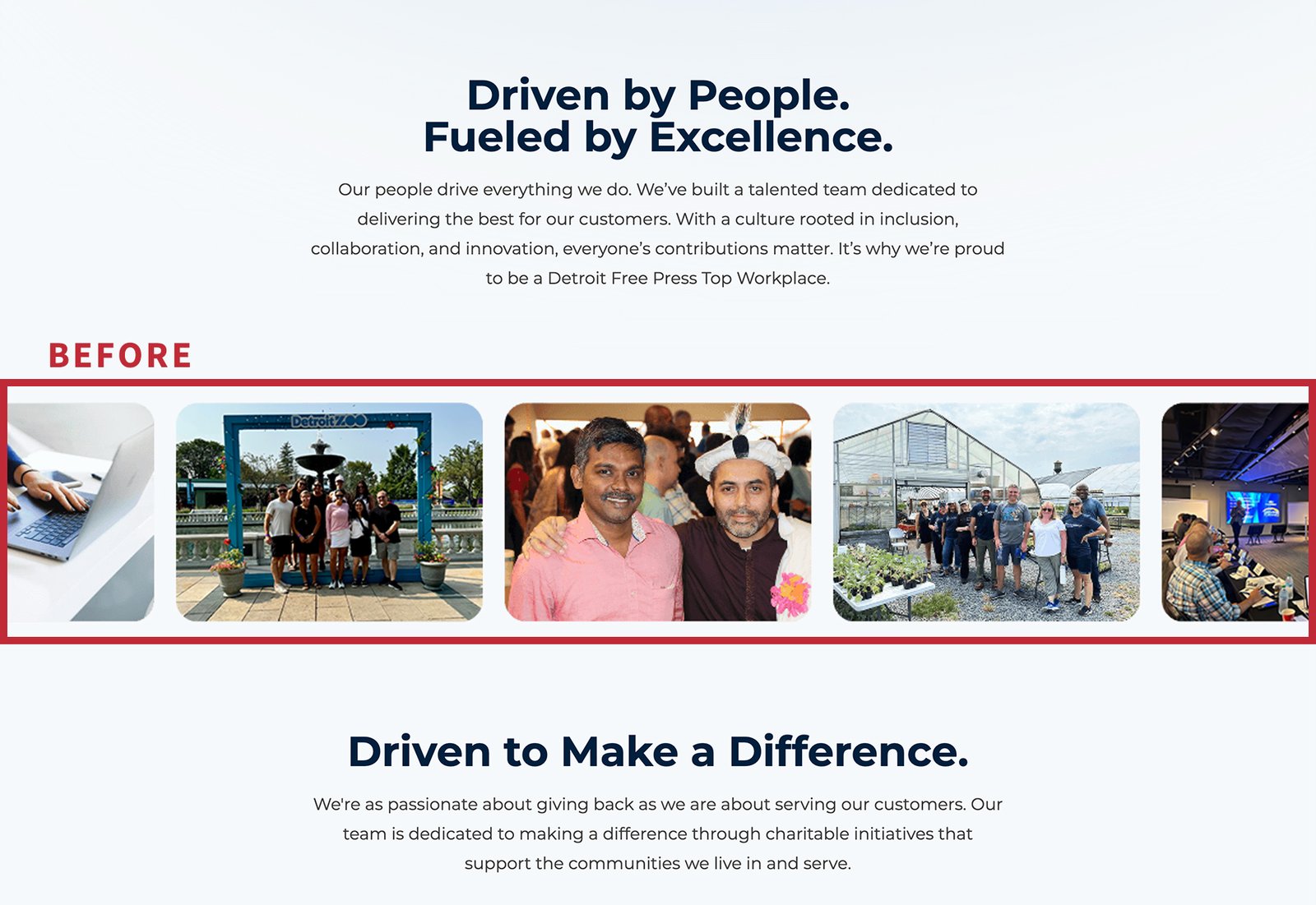
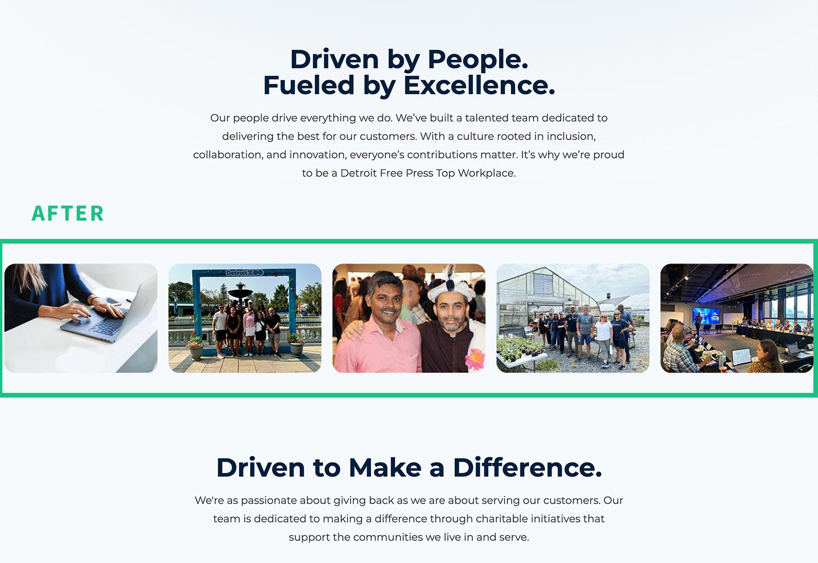
To ensure the site didn’t feel cold, we used photography of real FordDirect employees, adding a crucial human element. We balanced this with custom icons and animated data illustrations to reinforce the advanced technology aspect. - General Components & Spacing
Interactive information carousels were utilized to engage users and implemented strict negative space rules to ensure the content remained incredibly easy to read.
Leadership’s Vision
Key Stakeholders Goals
I sat down with FordDirect’s senior leadership to align on the ultimate mission. The biggest takeaway? This website wasn’t a sales tool—they already had fantastic relationships with their dealers. Instead, the primary goal was to proudly showcase their identity as a premier automotive tech company, specifically designed to attract top-tier talent and future business partners.
Key Insights:
- Must exude a modern “Tech” aesthetic.
- Must balance clean design with highly informational content.
- Must authentically showcase FordDirect’s company culture alongside its solutions.
- Must provide a seamless way for candidates to find job opportunities.
- Must offer an easy way for potential partners to reach out.
Feature Roadmap
Working hand-in-hand with the marketing agency, we ruthlessly trimmed down the sitemap to just a handful of core pages. This ensured the user journey remained as simple and intuitive as possible.
Design
Wireframes
With the structure locked in, the agency drafted the initial wireframes. I reviewed these layouts, provided UX feedback, and collaborated closely with their design team to ensure the aesthetic perfectly aligned with FordDirect’s expectations. After a few iterations, we landed on a stunning design that had leadership absolutely thrilled!
Design System
While the agency provided the foundational page mockups, it was up to me to build a comprehensive design system around them. I broke down every page mockup and meticulously recreated the key components in Figma. By establishing a scalable system for typography, colors, spacing, buttons, tiles, and carousels, we ensured the internal team could easily expand the website in the future without needing to constantly rely on the external agency.
Development
Planning & Processes
With the final mockups and design system in hand, it was time to build. I was assigned two developers for the project. To keep us on track, I created a detailed priority list of all components, estimated the dev time, and assigned tasks. I then translated these into Jira tickets organized by weekly sprints, holding daily and weekly touch-bases to proactively clear any roadblocks.
Management of Front-End & Back-End
Our internal dev team were absolute wizards on the back-end, but front-end styling wasn’t their strongest suit. To keep the momentum going, I rolled up my sleeves and coded all the HTML and CSS for all the components and sections. This drastically reduced the back-and-forth communication and completely eliminated the usual post-development styling scramble, allowing the developers to focus entirely on making sure the complex backend functionality worked flawlessly.

ADA Compliance
Accessibility is never an afterthought! Throughout development, I rigorously reviewed our code and content to ensure the site was as ADA-compliant as possible. By running regular Lighthouse audits, we quickly identified and resolved any accessibility issues before launch.
Testing & Tweaking
Working with the Testing Team
Before going live, I moderated extensive testing sessions across mobile, tablet, and desktop devices to ensure everything was bulletproof.
- Hunting for any responsive styling bugs.
- Reviewing the dynamic open positions on the Careers page.
- Clicking through job links to ensure proper routing.
- Auditing page load times.
The testing team caught a few crucial issues:
The Fixes: Our animated illustrations were loading too quickly (before entering the viewport) so we adjusted their timing. We also smoothed out some minor alignment issues on the mobile carousels.
Leadership Approval
With the bugs squashed, I presented the final build to leadership. Aside from requesting a quick tweak to some photo strips that were bleeding off the page, the feedback was overwhelmingly positive! They loved the new look and felt it finally represented FordDirect as the true tech powerhouse they are.
Final Design


